Awafi.
Awafi is a small, women-owned business that outgrew selling product with Google forms, and needed a better, scalable new digital storefront to call home and grow with.
Project type: Responsive, mobile first e-commerce website
Duration: 6 weeks
Project role: UX research, UX design, copy, product photography
The Brief, in brief
The Brief
Awafi, a female-founded spice boutique established in 2020, offers curated spice mixes, individual spices, and recipes rich in history. Despite a grassroots fan base, they lacked scalability without an online store, relying on Google forms for orders. This limitation led to missed opportunities for profit and market expansion.
Task: Design a quick MVP of Awafi’s first website, so they can establish a digital storefront and continue to reach more customers and grow the business.
Agreeing on deliverables
The stakeholder and I met to determine what deliverables to prioritize.
We decided to launch the website as an online store first, deferring the addition of a recipe blog until later due to a lack of content, prioritizing a better user experience over potential disappointment.
Her #1 business need was to sell products, not share recipes.
Challenges & Considerations
1 - No product photography - Leveraging my photography skills, I captured and edited images of Awafi's products, along with creating web banners and hero images.
2 - Working with existing branding - The new website's UI and visual design must align with Awafi's existing logo used on product labels to maintain visual consistency.
3 - Squarespace compatible - Ensured design decisions align with Squarespace's capabilities, per stakeholder’s request.
4 - Marketing Strategy vs. UX Strategy - Struck a balance between presenting Awafi as a brand and focusing on user-centered design.
5 - Managing stakeholder expectations - To manage stakeholder expectations, Awafi required assistance in prioritizing features for the website's iterations, a process accomplished through planning discussions.
Research
To get started, I wanted to talk to consumers about the way they shop online.
Business goal:
To drive Awafi product sales through a D2C e-commerce site.
Research goal:
We want to know what users value when they shop for new foods online so that we can create an online store that speaks to those shared values in order to sell Awafi products.
What we need to know to get there:
Assumptions & Risks:
People look for nutritional value and ingredients when shopping for new food and pantry items.
People read reviews
People care about things like GMOs
People are more inspired to buy something if it is local/small business/women owned/etc.
What did we learn?
There were 3 main takeaways from my interviews:
People like to see the brand values because they feel better about buying things and supporting brands that align with their values
People like to see the brand values listed and obvious because they feel better about buying things and supporting brands that align with their values
Product photography plays a crucial role in information gathering as people are visually inclined and often prefer images over written descriptions, akin to an in-store experience.
So what’s the problem?
People shopping for pantry items online want to feel good about what they buy. They want to easily understand, browse, and purchase items online with minimal opportunities to question their purchase.
How might we make the shopping and checkout process as seamless, intuitive, and visually engaging as possible to reduce the mental load on our users and encourage them to complete a purchase?
Who’s our target user?
Ideate, iterate, ideate…
Following the question, "Does the MVP meet both business and user needs without this feature?" we established design priorities.
Learning from the best
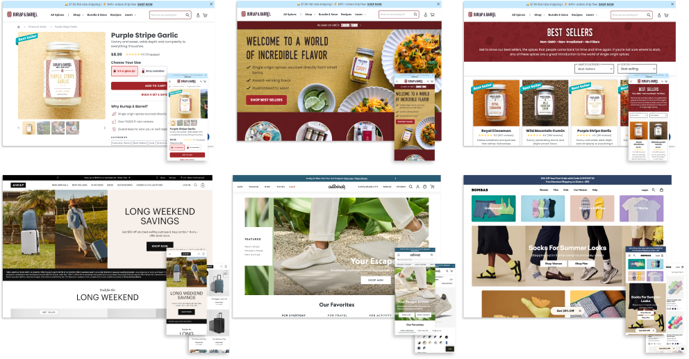
To start brainstorming solutions, I looked for inspiration in other successful CPG ecommerce sites. This way, I familiarized myself with some common Best Practices and repeating UX and UI patterns utilized in the space.
I paid special attention to product page layouts, Add-To-Cart flows, and checkout flows.
By repeating those same patterns, I’d ensure Awafi’s visitors have an easy time navigating the website to purchase an item.
From site maps to sketches
I utilized site mapping and user flows during my sketching process to make sure I had a roadmap for what to design.
I took inspiration and direction from the ecommerce site structures I’d researched, to ensure Awafi had everything it needed for an MVP, and set up the structure for future iterations.
Sketching
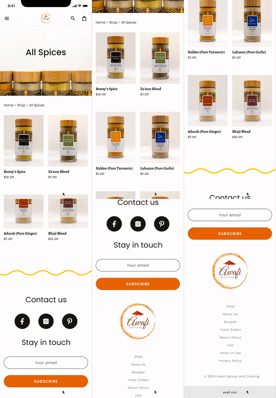
I sketched a few different versions for a homepage, product display pages, and product list pages to present to the stakeholder.
Homepage sketches:
Product page sketches:
A dash of branding
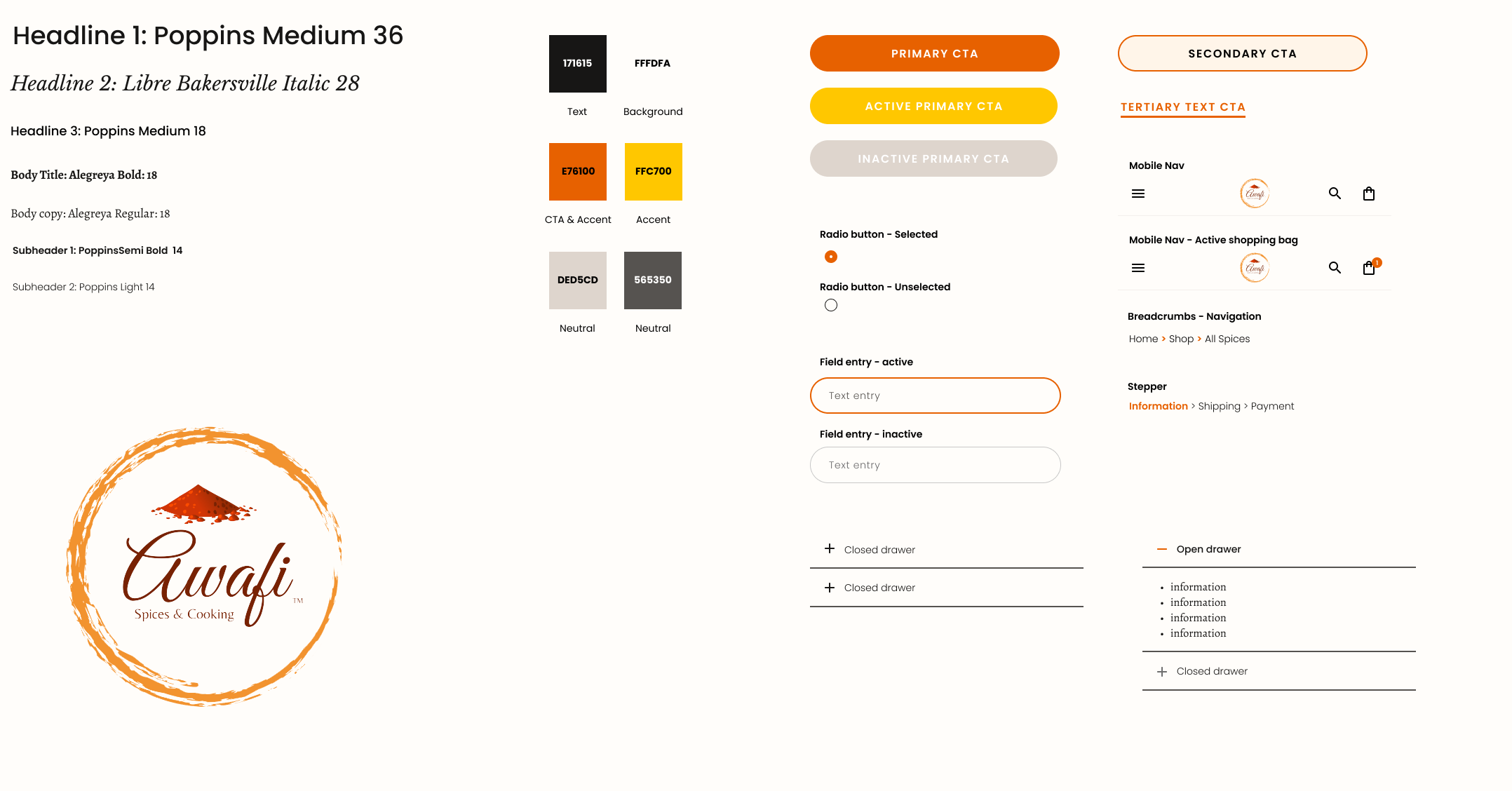
Awafi wanted the website to feel clean and modern but established, with an air of nostalgia. They wanted bright vibrant colors inspired by spices.
I opted for orange as my primary call-to-action and accent color, to evoke warmth and stimulate appetites.
This cheerful hue, reminiscent of the rich spices found globally (including Awafi's offerings), complements the brand's ethos. Additionally, I paired a contemporary sans-serif with a classic serif typeface to blend modernity with heritage, mirroring Awafi's commitment to connecting generations through its spices.
I applied the branding to the mid-fidelity digital wireframe to test something more hi-fidelity with users.
Taste Testing
I tested the prototype to ensure users could easily understand who Awafi is, what they sell, and make a purchase.
Although users eventually completed all tasks and flows I tested, some required 2-3 attempts. These tasks were adjusted to be completed on the first try to meet user expectations. Other visual inconsistencies were addressed as well, making for an overall smoother user experience.
Made it easier to navigate through product photography
Made sure there were multiple ways to exit a page
Larger type for easier readability
The final product
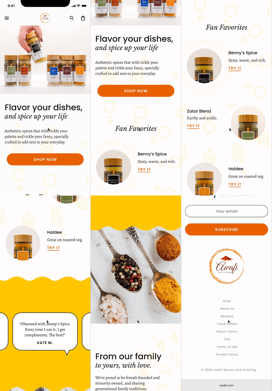
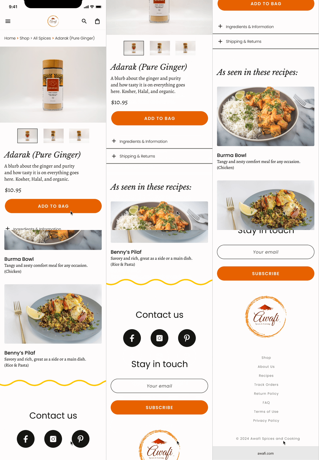
Awafi's website design prioritizes ease of use for the users.
The homepage features a prominent About/Story section to align with users' preference for supporting brands with similar world views.
Product information is available both visually and textually to accommodate different preferences.
The checkout process is segmented to reduce mental burden, with options for express or manual checkout to suit individual preferences.
Bon appetit!


